

NextGuide Part 2
NextGuide Part 2
After settling on our users and their primary goals, I mapped out the possible paths and the features through the app. With a solid understanding of who we were designing for, and the problems we were trying to solve for our users, we began ideating on possible solutions.
To help users quickly distinguish between movies and TV shows, I chose to use landscape images for TV (matching the aspect ratio of TV screens), and portrait images for movies since they looked like movie posters. (Positive response from users validated this assumption, and the idea would carry over into all future iterations.)
There were two primary directions we explored. The first was a magazine-like approach, sort of like a traditional TV guide, which displayed most of the relevant information up front.
The other was a less conventional approach, showing less information, but a lot more content options.
I made high-fidelity mockups of the two directions to put in front of test subjects to which they responded to best.
Early tests showed us that users preferred to see more content options than content information, so we shelved the magazine concept and dove into the tiled view concept.
In this "tile" view, users could see quite a few options for shows they could “watch now.”
The content initially shown to the users was defined by a combination of user preferences and availability. Users would see what is on now (or about to air), what’s new to streaming, and what their friends are watching or interacting with. Categories could be accessed by swiping left or right, or directly through the menu. Users could add or remove categories based on genre or even custom interests.
We did a few iterations in an effort to know just how much visual information users needed to see up front, and how much was too much. The rest of the information that users might want to explore was placed on content cards that could be accessed by tapping on a show tile.


An additional feature would allow a user to save their search keyword as an alert and/or a custom category. For example, if a user searched for the keyword “chuck norris,”, the user could get an alert whenever shows or movies featuring Chuck Norris. They could also jump to that custom category, or “interest.”
One of the final stories we addressed was the social features integrations, and designed the Social Pane. This allowed users to see which of their friends from their preferred social network were in the app, so they could connect to discover something good to watch.
NextGuide Launch
NextGuide Launch
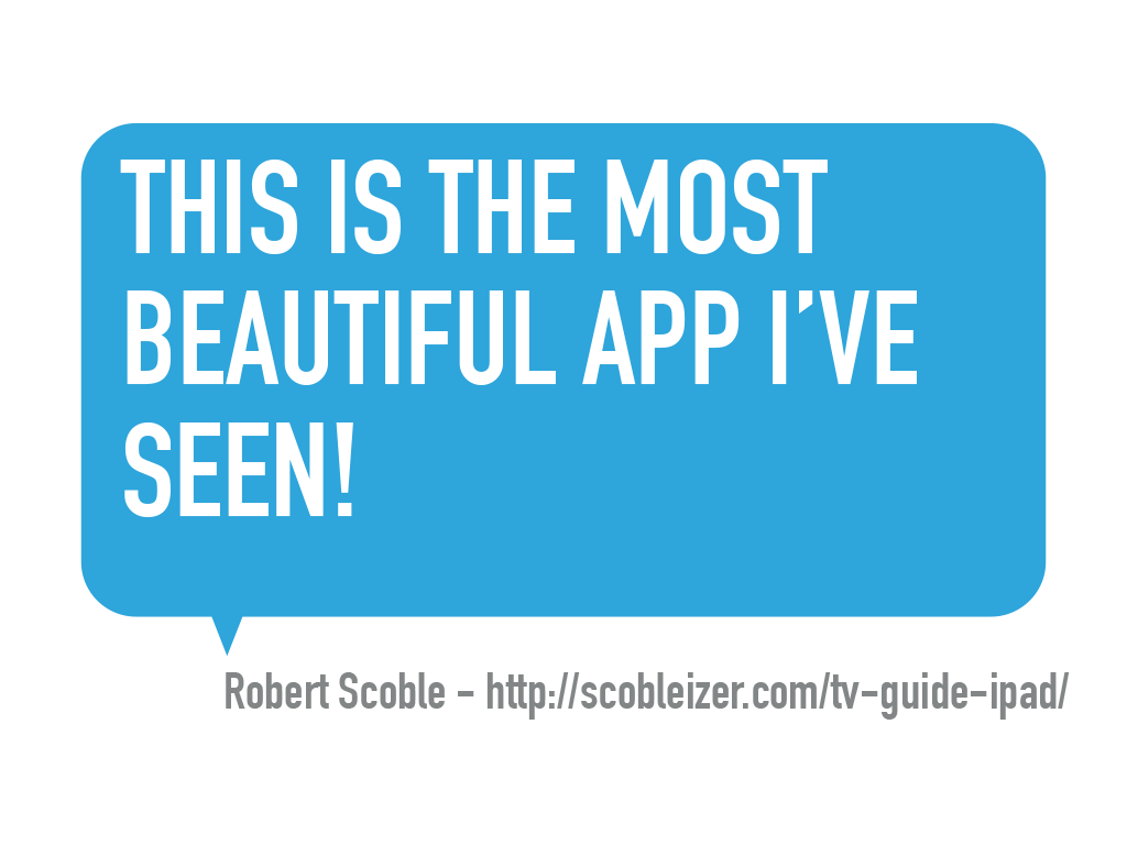
We launched the app as “NextGuide” to critical acclaim from several highly respected sources–including Robert Scoble.
Skeuomorphism design style was still the mantra at Apple, and demands for FX heavy graphics were high, which influenced the final visual design of the app.
NextGuide Platform
NextGuide Platform
Through our analytics, we found that we had more users trying to interact with NextGuide on smartphones than tablets. It was apparent that we needed an iPhone app, and decided on a mobile-optimized web versions for other devices.
This was about the time rumors of Apple ditching skeumorphism for flat design started surfacing. I took advantage of this to make a sea change in visual design to bring the products in line to current design trends, and improve the product.
The biggest UI change was also to have the biggest–and positive–impact on the business. I moved the main Action buttons to the forefront, placing them on the show tiles, rather than one level down on the show detail card. This dramatically boosted user interaction; we saw a huge uptick in users saving titles to Favorites and Watchlists. We also created our “Remind Me to Watch” feature, which grew out of the “set alert” action we had in the app, and proved to be the most valuable feature of the platform–for users and the business.


As for the website, what we began calling the WebGuide was designed to work and look beautiful on all devices, regardless of viewport size. With more than six breakpoints, there were few devices the site did not display nicely on.


Using MixPanel and Optimizely, we were able to A/B test features, and design elements for both the iPhone and WebGuide on mobile & desktop, and optimize accordingly.


The new modular design developed for the iPhone would make updating the iPad app quick and easy, but before that could happen, Dijit was acquired by Viggle. Unfortunately, the acquisition put on hold many of the product updates we had in the pipeline, and almost all support on the apps stopped as members of the team were re-deployed throughout the new organization.
Next Up
Funny Or Die Case Study

Wetpaint.com Case Study